

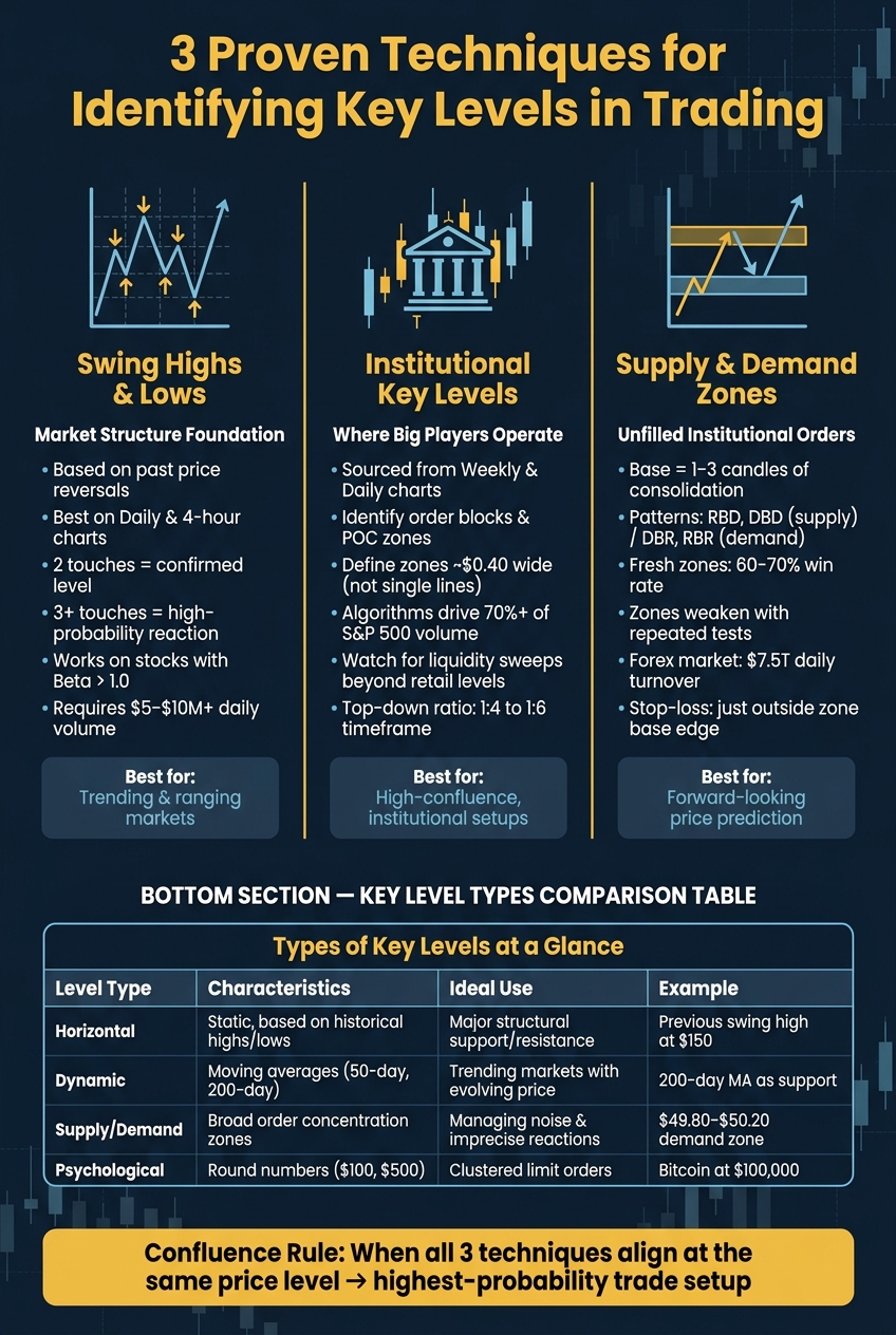
Key levels in trading are essential for identifying price zones where market behavior shifts, helping traders make informed decisions. This article outlines three methods to pinpoint these levels:
- Swing Highs and Lows: Use past price reversals to find strong support and resistance levels. Focus on clear swings visible on daily or 4-hour charts.
- Institutional Levels: Identify areas where large players like banks and hedge funds have placed significant orders. These levels often align with daily or weekly charts and show where price may react strongly.
- Supply and Demand Zones: Spot areas of concentrated institutional activity where price moved sharply. These zones predict future reactions when revisited.
3 Key Level Identification Techniques: Comparison Guide for Traders
Support and Resistance Zones: Master the Art of Finding Key Levels Fast
Core Principles of Key Levels
Understanding the principles behind key levels can improve risk management and refine trade planning. These levels form where large clusters of orders accumulate, signaling shifts in market sentiment. Such clusters often arise from institutions, algorithms, and retail traders reacting to previous price movements.
"Support and resistance are memory zones in the order book. They exist because human and algorithmic participants remember significant prices." - Jarviix
Key levels come in different forms:
- Horizontal levels: These are fixed price points drawn from previous swing highs and lows. They remain static and are closely monitored by traders.
- Dynamic levels: Examples include moving averages like the 50-day or 200-day. These levels adjust as new price data becomes available and often act as moving support or resistance in trending markets.
- Supply and demand zones: These are broader price ranges where orders cluster. Drawing a rectangle (e.g., $49.80–$50.20 for a $50 level) instead of a single line helps account for typical price fluctuations or wicks.
- Psychological levels: Round numbers like $100 or $500 often attract attention from both retail and institutional traders, leading to concentrated order activity.
| Level Type | Characteristics | Ideal Use |
|---|---|---|
| Horizontal | Static, based on historical highs/lows | Identifying major structural support/resistance |
| Dynamic | Moving, based on averages (e.g., MAs) | Trending markets with evolving price action |
| Supply/Demand | Broad areas of order concentration | Managing market noise and imprecise reactions |
| Psychological | Round numbers (e.g., $100, $500) | Spotting areas with clustered limit orders |
A key distinction in trading is between reaction and validation. A single bounce off a level is just a reaction - it doesn’t confirm the level’s strength. Validation, however, occurs when a level is tested multiple times (e.g., the "3-touch rule") or when a breakout is supported by a close beyond the zone with volume at least 1.5 times the average daily volume.
A great example of validation came in December 2024 with NVIDIA. Its $134–$135 support zone was tested repeatedly, with intraday lows briefly reaching $133.98 but never closing below $134. This confirmed the zone as a reliable support level.
To filter out market noise, multi-timeframe alignment is crucial. Weekly and daily levels carry more significance than intraday levels. When a horizontal level on a daily chart coincides with a key dynamic level like the 200-day moving average, the confluence often produces more reliable price reactions. A practical approach is to start with weekly or daily charts to identify major levels, then shift to lower timeframes, such as 1-hour or 15-minute charts, to fine-tune entry points.
With these foundational concepts in place, the next step is learning how to identify key levels using swing highs, swing lows, and range boundaries.
1. Swing Highs, Swing Lows, and Range Boundaries
Swing highs and lows are the foundation of understanding market behavior. A swing high occurs when the price climbs, pauses, and then declines, while a swing low happens when the price drops, stabilizes, and then rallies strongly. These points reveal whether a market is trending or consolidating and highlight areas where institutional traders have been active in the past. This basic analysis lays the groundwork for more advanced trading strategies.
Effectiveness in Identifying Key Levels
Swing levels are effective because markets tend to "remember" past price zones. When the price revisits a level where a significant reversal once took place, large market participants often respond in a similar way. Levels become stronger with repeated tests - two touches can confirm a level, and three or more increase the likelihood of a strong reaction.
A simple yet valuable guideline: if a swing doesn’t stand out at a glance on a Daily or 4-hour chart, it’s probably not a significant one.
"If you have to convince yourself it's a swing, it's probably not a swing." - The Simple ICT
Not all swings are created equal. Strong swings are those that the price respects and defends consistently, while weaker swings often serve as targets for institutions looking to capture liquidity from retail traders' stop-loss orders. Understanding this distinction is crucial before applying these concepts to various trading time frames.
Ease of Application for U.S. Intraday and Swing Trading
The beauty of swing analysis lies in its simplicity. Traders can start by identifying major structural levels on a Daily chart and then refine their entries using 1-hour or 15-minute charts. On intraday charts, look for swings confirmed by 3–5 candles, while on 4-hour or Daily charts, use 5–8 candles. Similarly, when price consolidates between a clear high and low for 5 to 20 or more candles on a Daily chart, those range boundaries become important areas to monitor.
Adaptability to Different Instruments
Swing analysis isn’t limited to one market - it works across U.S. equities, forex, index futures, and commodities. This consistency stems from predictable institutional behavior. For equity traders, focusing on stocks or ETFs with a Beta above 1.0 can help, as these instruments often produce more pronounced and cleaner swings.
This method is particularly effective for assets with sufficient liquidity (at least $5–$10 million in daily trading volume) and can be even more powerful when combined with round numbers or significant moving averages. As one of three proven trading techniques, swing analysis complements institutional and supply-demand strategies by offering clear, repeatable zones for potential market reversals.
2. Institutional Key Levels from Higher Time Frames
Swing highs and lows provide a market's structure, but institutional key levels reveal where the big players - banks, hedge funds, and algorithms - are actually active. These levels, found on Daily and Weekly charts, highlight where major positions are built or offloaded. By combining this perspective with swing analysis, traders can better understand the forces driving market moves. Let’s look at how these institutional signals work and why they’re so effective.
"A single timeframe only tells a fraction of the story. By combining perspectives, you build a complete picture of where price is likely to go next."
Effectiveness in Identifying Key Levels
Institutional activity leaves behind clear markers, such as order blocks (the last candle before a strong price movement), Supply and Demand Zones, and Points of Control (POC), which represent areas of concentrated volume acting as "fair value" magnets for algorithms. Recognizing these markers helps traders refine their analysis and identify high-probability setups. For example, when a daily pivot aligns with a 4-hour order block inside a weekly demand zone, the odds of a successful trade increase significantly.
An important takeaway: institutions often use retail support and resistance levels as liquidity pools. Instead of respecting these levels, they push prices beyond them to trigger stop-loss orders, only to reverse sharply - a tactic known as a liquidity sweep. A notable example occurred in October 2023 when Tesla’s stock approached the widely watched $180 support level. Institutional traders pushed the price down to $178.43, breaking the level by 0.87% and triggering retail stops. Volume surged to four times the average at that low before the price rebounded to $181 within 12 minutes and closed at $186 by the end of the day. Elena Vasquez, a Price Action & Day Trading Coach, captured the essence of this strategy:
"Traders were drawing lines while institutions were hunting liquidity."
Ease of Application for U.S. Intraday and Swing Trading
The best way to use institutional key levels is through top-down analysis: start with the Weekly chart to spot major zones, move to the Daily chart for context, and only drop to lower timeframes like the 15-minute or 5-minute charts for trade execution. A practical ratio is 1:4 to 1:6 - for instance, use a 60-minute chart for trend direction and a 5-minute chart for entries. Here's how this approach suits different trading styles:
| Trading Style | Trend Timeframe | Entry Timeframe |
|---|---|---|
| Scalping | 15-minute chart | 1–2-minute chart |
| Day Trading | 60-minute chart | 5-minute chart |
| Swing Trading | Daily chart | 1-hour chart |
| Position Trading | Weekly chart | Daily chart |
Rather than focusing on exact price points, define institutional zones as narrow ranges - around $0.40 wide - to account for minor fluctuations. Additionally, keep an eye on naked POCs (untested Points of Control from previous sessions) to identify potential momentum vs mean-reversion targets often favored by institutional traders. This approach works well across different markets.
Adaptability to Different Instruments
Institutional levels are effective across various asset classes, from U.S. indices and equities to FX pairs, because the core behavior is the same. Large players need to execute massive orders without moving the market against themselves, leaving behind identifiable footprints. For instance, gold often respects round numbers like $2,000 or $2,500 due to central bank activity, while Bitcoin has historically found support at the 200-week moving average without closing below it on a weekly chart. In the S&P 500, algorithmic trading drives over 70% of volume, with algorithms programmed to react to institutional price zones rather than the horizontal lines drawn by retail traders.
3. Supply and Demand Zones
Supply and demand (S/D) zones build on swing analysis and institutional key levels by offering a forward-looking way to understand price movements. Instead of using a single horizontal line, these zones mark a price range where institutional orders were only partially filled. When the price revisits these areas, the remaining orders can be triggered, often causing a significant reaction.
Effectiveness in Identifying Key Levels
Unlike traditional support and resistance, which focus on past price reactions, S/D zones predict future price moves based on unfilled institutional orders. These zones are defined by a small "base" - usually 1 to 3 candles of consolidation - followed by a sharp price move. Traders commonly identify four patterns within these zones: Rally-Base-Drop (RBD) and Drop-Base-Drop (DBD) for supply, and Drop-Base-Rally (DBR) and Rally-Base-Rally (RBR) for demand.
The quality of a zone depends on three key factors:
- Strength of Departure: How quickly the price moves away from the base.
- Freshness: Whether the zone has been tested before.
- Tightness of the Base: A narrower base often indicates stronger potential.
Fresh zones that show clear rejections tend to have a win rate of around 60–70%. However, it's important to note that zones weaken with repeated tests, as unfilled orders are gradually absorbed. This contrasts with the traditional view of support and resistance, where levels are often thought to strengthen with multiple touches.
"The key insight: a level that's been tested 8 times is weaker as supply/demand than a level that price visited once and then exploded away from." - CrossTrade
With this understanding, traders can apply supply and demand zones using a straightforward process.
Ease of Application for U.S. Intraday/Swing Trading
Start by identifying a broad S/D zone on a Daily or 4-hour chart. Then, refine the zone on a 15-minute or 5-minute chart to pinpoint entry points. Narrowing the zone allows for tighter stop-loss placement, improving the risk-to-reward ratio. Place stop-losses just outside the edge of the base to account for normal price fluctuations. For the best results, trade demand zones in bullish markets and supply zones in bearish markets. Trading against the trend significantly lowers the chances of a clean reaction. This approach works well across different timeframes, from intraday to swing trading.
Adaptability to Different Instruments
Supply and demand zones work across various asset classes because they rely on the universal concept of institutional order flow. Whether you’re trading S&P 500 futures (ES), EUR/USD, or individual stocks, large institutional players can't fill massive orders at a single price, leaving behind identifiable zones. The forex market, with its daily turnover exceeding $7.5 trillion, is particularly well-suited to this analysis. Additionally, the same RBD or DBR patterns seen on a daily stock chart apply just as effectively to a 4-hour forex chart, with no adjustments needed.
Building a Daily Key Level Map
Now that you’re familiar with swing highs/lows, institutional levels, and supply and demand zones, the real advantage lies in combining all three into a single, organized daily map. The aim isn’t to clutter your chart with every possible level - it’s to highlight the 3–5 strongest, most reliable zones. Start with a top-down approach: begin on the weekly chart to identify the absolute yearly highs and lows. Then, move to the daily and 4-hour charts to fine-tune these into more specific price zones. Use rectangles to account for price fluctuations within these zones. The 15-minute or 5-minute chart should only be used for pinpointing entry timing once price reaches one of these key areas. This workflow keeps your chart clean and your decisions efficient. By combining these techniques, you’ll focus on high-confluence zones that stand out for their potential.
The best trade setups often emerge when multiple techniques overlap in a single price area. For instance, imagine a daily swing low aligning with a psychological round number like $100 or $150 within a fresh demand zone. This alignment signals that many traders are likely watching that level. As GrandAlgo explains:
"The highest-probability trades happen when multiple types of support and resistance align."
Once your key zones are mapped, the next step is executing trades with precision when confirmation appears. Combining swing levels, institutional levels, and supply/demand zones can greatly improve trade quality. Look for confirmation through a rejection candle, such as a pin bar, hammer, or engulfing pattern. For breakouts, wait for the price to close a full candle beyond the zone and watch for a retest before entering. Set stops just outside the zone to avoid being caught by normal price fluctuations, and always limit risk to 1–2% per trade. Keep your map updated daily: if a support level breaks, convert it to resistance, and remove zones that price has fully consumed.
If you’re looking to refine this process without putting real money at risk, For Traders offers a way to practice building and trading from a key level map using virtual capital. Starting at $46, you can access $6,000 in virtual funds to test your strategies, improve entry timing, and develop pattern recognition in actual market conditions - all without financial risk.
Conclusion
Identifying key levels in trading isn't about cluttering your charts with endless lines. Instead, it’s about focusing on key areas like swing highs and lows, institutional levels, and supply and demand zones. Swing highs and lows show where prices have historically reversed. Institutional levels often mark areas where large-volume orders are concentrated. Supply and demand zones highlight spots of aggressive buying or selling. Together, these techniques create a structured and repeatable way to analyze any chart.
The real advantage lies in confluence - when all three methods align at the same price level, the probability of a strong setup increases significantly. As the Traders Agency Team explains:
"Mastering support and resistance is the foundation of all technical trading. Once you can consistently identify where buyers and sellers are concentrated, every other strategy you learn will become more effective."
This alignment is what prepares traders for action in real market conditions. While understanding these concepts is important, true mastery comes from practice. Using a simulated trading environment allows traders to hone their skills, build precision, and develop the pattern recognition needed for success - all without risking real money.
Platforms like For Traders offer a way to practice these techniques. With plans starting at $46, you can access $6,000 in virtual capital to refine your approach in live market conditions. By consistently mapping out your daily key levels, you’ll build the consistency and confidence necessary before transitioning to real-world trading.
FAQs
How do I choose which key levels matter most?
When pinpointing key levels in trading, focus on areas that have been tested repeatedly and have shown a strong historical impact. These are spots where the price has reversed at least three times, indicating their reliability.
Start by analyzing higher timeframes, such as daily or weekly charts. These broader perspectives help you identify stronger and more dependable levels. Once you've marked those, you can fine-tune your analysis on lower timeframes to get a more detailed view.
To keep your charts clean and easy to read, prioritize 3 to 5 critical levels. Too many lines can create unnecessary clutter and make decision-making harder.
For added confidence, look for confluence points - areas where your key levels align with other indicators like volume spikes, candlestick formations, or moving averages. These confirmations can help you determine the significance of the levels you've identified.
What confirms a real breakout versus a fakeout?
When a breakout happens, it's considered legitimate if it meets a few key criteria. First, it should occur with high trading volume, showing strong market interest. Second, the breakout candle must close clearly beyond the level being tested. Lastly, there’s often a retest of the level afterward, but with lower volume, which reinforces the idea that the breakout reflects real market activity rather than a deceptive move.
How wide should I draw a supply or demand zone?
When identifying a supply or demand zone, its width should match the base that triggered the strong price move. This base usually spans 1 to 3 bars. Make sure the zone fully encompasses the entire consolidation area that occurred before the sharp move. This is because institutional orders are often distributed throughout this range.
Zones formed from narrow bases tend to be tighter and result in stronger price reactions. On the other hand, wider bases create zones that are more spread out, leading to weaker reactions.
Related Blog Posts
Start Trading with For Traders
Join our platform to test your trading skills, trade virtual capital, and earn real profits. Access educational resources, advanced tools, and a supportive community to enhance your trading journey.
Start your Trading Challenge