

Multi-timeframe analysis (MTFA) helps traders make better decisions by examining an asset across different timeframes. This approach combines higher timeframes for trend direction, medium timeframes for setups, and lower timeframes for precise entries. Key indicators like moving averages, RSI, MACD, support/resistance levels, Fibonacci retracements, ATR, and candlestick patterns play crucial roles in refining trades. Here’s a quick breakdown:
- Moving Averages (SMA/EMA): Identify trends and dynamic support/resistance.
- RSI: Pinpoints momentum shifts and overbought/oversold conditions.
- MACD: Tracks trend strength and momentum.
- Support/Resistance Levels: Marks key price zones for turning points.
- Fibonacci Retracements: Highlights potential pullback levels.
- ATR: Measures volatility for stop-loss placement.
- Candlestick Patterns: Visual cues for price action at critical levels.
SIMPLE Multi Timeframe Analysis TradingView Setup (Trading Strategy Included)

1. Moving Averages (SMA and EMA)
Moving averages are a cornerstone of multi-timeframe analysis, helping traders answer a key question: Where is the trend heading? The type of moving average you choose should align with the timeframe you're analyzing.
There are two main types to consider: Simple Moving Average (SMA) and Exponential Moving Average (EMA). The SMA assigns equal importance to all prices in its calculation, making it slower and smoother - perfect for higher timeframes where stability is key. The EMA, however, gives more weight to recent prices, allowing it to respond faster to market changes. This makes it better suited for lower timeframes where precision in timing entries and exits is critical.
A practical way to use moving averages is the 3-stack method. Here’s how it works:
- Use the 50-day and 200-day SMA on daily or weekly charts to establish the overall trend.
- Apply the 20-period and 50-period MA on 4-hour charts to track market structure.
- Rely on the 10-period and 20-period EMA on 1-hour or 15-minute charts to pinpoint entry triggers.
For the best results, ensure each timeframe is 4–6 times larger than the one below it (e.g., pairing 15-minute, 1-hour, and 4-hour charts for day trading). This layered approach provides clarity without creating logical gaps between timeframes. Additionally, moving averages often act as dynamic support and resistance levels. For instance, in an uptrend, the 20-period and 50-period MAs frequently serve as support, while in a downtrend, they act as resistance.
One of the most well-known signals involving moving averages is the Golden Cross, which occurs when the 50-day SMA crosses above the 200-day SMA. Historically, this signal has proven powerful. Since 1970, the S&P 500 has seen average gains of about 15% in the 12 months following a Golden Cross. Furthermore, these signals have led to sustained rallies roughly 70% of the time.
However, moving averages aren’t foolproof. They work best in trending markets but often fail in sideways or choppy conditions, where they can produce misleading signals. Bruce Powers, CMT, captures this idea perfectly:
"A bullish engulfing pattern on a 15 minute chart means absolutely nothing if the trend on the daily chart is bearish."
To avoid common pitfalls, limit yourself to three moving averages per chart, confirm crossovers with volume, and never let lower-timeframe signals override the bigger-picture trend. With discipline, moving averages can become a powerful tool in your trading arsenal.
2. Relative Strength Index (RSI)
The Relative Strength Index (RSI) is a tool that helps traders measure price momentum, offering insights into market trends. By analyzing RSI across various timeframes, you can get a more detailed picture of momentum shifts. For example, use daily or weekly RSI to understand the broader trend, 4-hour or 1-hour RSI to identify divergences, and 15-minute or 5-minute RSI for pinpointing entry and exit points. This layered approach not only clarifies momentum but also helps in spotting clear trade setups and staying consistent during your analysis.
Here’s a practical example: if the daily RSI is above 50, it suggests focusing on long trades. If, at the same time, the 1-hour RSI drops below 30, it could indicate an ideal entry point. According to the Finwiz Technical Analysis Guide:
"If the RSI is oversold on both the daily and 4‑hour charts, the bullish signal is stronger."
One of the most dependable RSI signals is divergence. This happens when the price hits a new high, but the RSI fails to follow suit. Such a mismatch often indicates that the trend is losing steam, signaling a potential reversal. This is particularly effective on the 4-hour chart, as it provides enough time to adjust your position. Additionally, in strong uptrends, RSI pullbacks often stabilize within the 40–50 range on medium or lower timeframes. In contrast, during downtrends, relief rallies typically stall near the 50–60 range. These zones act as a midline and can be useful for timing pullback entries.
To make the most of RSI, avoid these common mistakes:
- Overlooking higher timeframes.
- Overcomplicating your analysis with too many timeframes.
- Letting confirmation bias cloud your judgment. These psychological hurdles are often why traders fail funded challenges even when using reliable indicators.
3. MACD (Moving Average Convergence Divergence)
The MACD is a powerful momentum indicator that helps analyze trends across multiple timeframes. It measures both the direction and strength of a trend. Similar to RSI, MACD shines when used with a top-down approach to fine-tune entry points.
Here’s a practical way to use it: adopt the 4-hour/1-hour/15-minute timeframe strategy. The 4-hour MACD reveals the broader trend, the 1-hour chart highlights pullbacks or consolidations, and the 15-minute chart helps pinpoint precise entry opportunities. For instance, if both the 4-hour and 1-hour MACD show bullish signals - where the MACD line is above both the signal line and the zero line - you should focus on long trades on the 15-minute chart.
Pay close attention to the histogram and the gap between the MACD and signal lines. When the gap widens, it suggests growing momentum. On the other hand, a narrowing gap or a shrinking histogram across timeframes often signals that the trend may be slowing down, hinting at potential consolidation rather than a continuation.
To enhance your strategy, pair MACD with the Average True Range (ATR) for setting stop-losses. For example, place stop-losses just below the previous candle’s low and use the higher timeframe trend to determine profit targets. Many traders stick to fixed parameters, such as a 1% stop-loss and a 1.5% take-profit ratio, to maintain consistency. This structured method works well alongside earlier techniques, confirming momentum shifts across different timeframes.
It’s important to avoid starting your analysis on lower timeframes or juggling more than three timeframes. Doing so can lead to confirmation bias and overcomplication. If the MACD signals don’t align across your selected timeframes, it’s better to wait for clarity before making a move.
4. Support and Resistance Levels
Support and resistance (S/R) levels are like road signs for traders, marking areas where price trends often pause, reverse, or break. These levels are crucial for identifying key turning points across various timeframes. The general rule? The higher the timeframe, the more meaningful the S/R levels. For example, a resistance level spotted on a weekly chart holds far more weight than one found on a 15-minute chart. This approach sets the foundation for multi-timeframe S/R analysis.
"The longer the time frame, the more reliable the signals being given. As you zoom in on shorter timeframes, the charts become more polluted with false moves and noise." - Investopedia
Start by examining weekly or monthly charts to pinpoint major S/R zones and determine the primary trend. Once those are clear, move to daily or 4-hour charts to identify corrections or consolidations. Finally, use 1-hour or even 15-minute charts to fine-tune your entry and exit points. When paired with technical indicators, aligning S/R levels across timeframes can significantly improve trading precision.
A powerful concept here is confluence - when S/R levels from different timeframes align in the same price zone. This alignment can boost trade success rates by 40%–50% compared to analyzing a single chart. Platforms like For Traders provide excellent opportunities to test this structured approach, helping traders improve both consistency and risk management.
However, there are common missteps to avoid. Starting analysis on lower timeframes can lead to tunnel vision, making it easy to trade against the dominant trend. Another mistake is placing stop-losses directly on S/R levels without accounting for recent volatility, which often results in premature exits. To avoid these pitfalls, always begin with higher timeframes, wait for candle closes to confirm breakouts, and use tools like RSI or MACD to validate the strength of a bounce or breakout.
"Higher timeframe support and resistance levels carry more importance, which is why you should always look for your levels on your higher timeframe." - Rolf, Founder, Tradeciety
5. Fibonacci Retracements
Fibonacci retracements are a popular tool for spotting where a price pullback might pause before the trend picks up again. After a significant upward or downward move, prices rarely continue in a straight line. Instead, they often retrace to specific levels - 38.2%, 50%, or 61.8% - before resuming their original direction. The 61.8% level, often called the "Golden Ratio", is especially important and is commonly seen as the final support or resistance point for the trend.
The best way to use Fibonacci retracements is with a top-down approach. Start by plotting the levels on a daily or weekly chart to identify major pullback zones and the overall trend. Then, move to a 4-hour chart to confirm intermediate corrections. Finally, use a 1-hour or 15-minute chart to fine-tune your entry points after validating the setup. This step-by-step process helps ensure you’re working with reliable price zones supported by multiple signals.
The concept of confluence plays a big role in improving the accuracy of Fibonacci retracements. For example, if a 38.2% retracement on a weekly chart lines up with a 61.8% retracement on a daily chart, it creates a stronger zone. When additional confirmation comes from a moving average or horizontal support, the effectiveness of the zone can jump from 40–50% to 60–70%.
"Confluence is not a coincidence. When multiple Fibonacci levels across timeframes point to the same zone supported by the structure and confirmed by price - that's when you trade with probability, not hope." - Jasper Osita, ACY Securities
Fibonacci levels can also guide stop-loss placement. For instance, if you enter a trade at the 61.8% retracement, placing your stop just beyond the 78.6% level can help you avoid getting caught by market noise. Platforms like For Traders let you practice this multi-timeframe Fibonacci strategy on demo accounts, helping you refine your skills before risking actual money.
To get the most out of Fibonacci retracements, avoid applying them to choppy, unclear price movements. Focus on clean, impulsive swings, using candle wicks for precision. And remember, Fibonacci levels should never be your only tool - always confirm them with other technical analysis tools like moving averages, MACD, or volume.
6. Average True Range (ATR)
The Average True Range (ATR) is a tool designed to measure price volatility over a specific period. Unlike many other indicators, it doesn’t signal direction but instead quantifies how much a market moves. This makes it incredibly useful for determining position sizes and placing stop-losses across different timeframes.
When paired with trend analysis, ATR can be tailored to fit your trading timeframe. For instance:
- Daily or weekly charts: ATR highlights overall market volatility - whether it’s trending strongly or moving sideways.
- 4-hour charts: It helps identify transitions between different volatility regimes.
- 15-minute or 1-minute charts: ATR filters out short-term noise, improving entry timing.
A handy rule of thumb: if the ratio of your short-term ATR to long-term ATR exceeds 1.5, the market is experiencing high volatility. In such cases, reducing your position size can help manage risk effectively.
For stop-loss placement, ATR offers a formulaic approach using risk calculators. In long trades, set your stop-loss at your entry price minus ATR × multiplier. For short trades, add ATR × multiplier to your entry. The right multiplier depends on your strategy:
- Day trading: 1.5x–2x
- Swing trading: 2x–3x
- Longer-term positions: 3x or more
Adjust the ATR period to align with your holding timeframe. Combine it with price structure for better precision - place your stop at whichever is farther: the ATR-calculated distance or just beyond the nearest support or resistance level. For example, in a real trade on BNBUSDT in August 2024, using an ATR-based stop-loss on a 12-hour chart limited the loss to only 2.96%. Without it, the loss would have been 11.78%, reducing the drawdown by 75%. Platforms like For Traders allow you to practice this approach risk-free on demo accounts.
Using ATR for risk management is a smart move:
"ATR-based position sizing maintains consistent risk levels across varying market conditions. By scaling position sizes inversely to current volatility, traders maintain steady dollar risk." - Tom Hartman, Author
However, traders often misuse ATR by sticking to its default 14-period setting, regardless of their trading style. For example, if you’re day trading on a 5-minute chart with an average hold of 45 minutes, a shorter ATR period will better reflect your actual risk environment. As Luka, Co-Founder of Tradyx.ai, wisely points out:
"ATR is not plug-and-play. It's a raw material that needs processing before it's useful."
7. Candlestick Patterns and Chart Patterns
Candlestick and chart patterns serve as the visual representation of price action. While tools like ATR and MACD provide numerical insights into market behavior, patterns illustrate how the market behaves at critical levels. Their power increases significantly when analyzed across multiple timeframes.
Using a top-down approach, start with the Higher Timeframe (HTF) to assess the overall trend. Look for key patterns like Head and Shoulders, Double Tops, or Double Bottoms. Move to a medium timeframe to spot setups such as flags or pullbacks. Finally, shift to the Lower Timeframe (LTF) to pinpoint entry triggers, such as Bullish Engulfing, Pin Bars, or Hammer patterns. This method ensures your visual analysis aligns with indicator signals. As Alexander Elder, author of Trading for a Living, wisely states:
"No single timeframe tells the complete story."
For instance, a Daily Bullish Engulfing candle might indicate a bullish bias, while a breakout on a 5- or 15-minute chart can refine the entry point with a tighter stop-loss. Combining these signals - often referred to as confluence - boosts the chances of a successful trade. This multi-timeframe approach enhances precision and confidence in your analysis.
Another key signal to watch for is deceleration. On a medium timeframe, smaller candlesticks near a major resistance level could signal waning momentum. This clue suggests looking for a reversal pattern on a lower timeframe before making a move.
Avoiding Common Pitfalls
One frequent mistake is acting on a buy signal from a 15-minute chart without considering the Daily chart’s strong downtrend. What seems like a breakout might actually be a dead-cat bounce. Another common trap is confirmation bias, where traders search across timeframes to find one that aligns with their desired trade. The solution? If signals conflict, always give priority to the higher timeframe. Stick with a specific timeframe combination for at least 30 to 50 trades to evaluate whether your strategy holds up statistically. Platforms like For Traders offer demo accounts, allowing you to practice this disciplined approach without risking real money.
| Timeframe Role | Purpose | Typical Patterns |
|---|---|---|
| Higher Timeframe (HTF) | Identify trend bias | Head & Shoulders, Double Tops/Bottoms, major support/resistance |
| Intermediate | Spot setups | Flags, pullbacks, chart pattern retests |
| Lower (LTF) | Fine-tune entries | Engulfing candles, Pin Bars, Hammers, breakouts |
Key Rule: Wait for Candle Closure
One golden rule to remember: never act on an incomplete candle. A Pin Bar or Engulfing candle is only valid once the period closes. Acting prematurely on a forming candle often results in false signals and poor trade entries.
Comparison Table
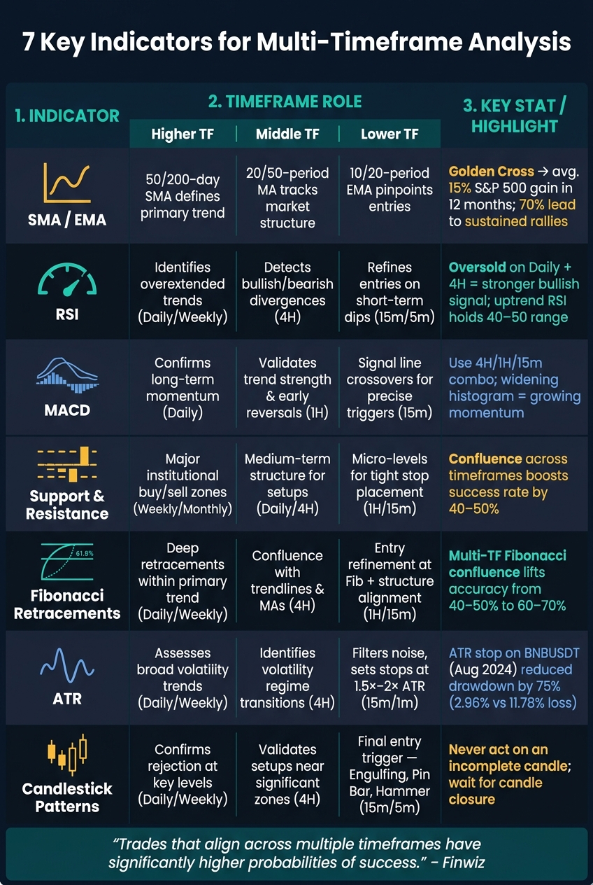
7 Key Indicators for Multi-Timeframe Analysis: A Complete Comparison
Below is a side-by-side breakdown of seven key trading indicators. The table highlights their primary functions, how they work across different timeframes, and their alignment with trading challenge risk rules.
| Indicator | Key Features | Higher TF (Trend/Bias) | Middle TF (Setup) | Lower TF (Entry/Timing) | Challenge Rule Alignment |
|---|---|---|---|---|---|
| SMA / EMA | Smooths price data to highlight trend direction; crossovers indicate momentum changes | 50/200-day SMA helps define the primary market phase | 20/50-period MA identifies intermediate trend shifts | 10/20-period EMA pinpoints pullback entry opportunities | Encourages trading with the trend, reducing risk of breaching daily loss limits |
| RSI | Tracks momentum on a 0–100 scale; overbought (>70) and oversold (<30) levels flag extremes | Highlights overextended trends on Daily/Weekly charts | Detects bullish/bearish divergences signaling potential reversals | Refines entries during short-term dips or peaks | Helps avoid entering trades when momentum is exhausted, boosting win rates |
| MACD | Combines trend-following and momentum; histogram shows move strength | Confirms long-term momentum on Daily charts | Validates trend strength and early reversals | Signal line crossovers on 1H/15m charts provide precise triggers | Offers objective entry/exit criteria, reducing emotional decisions |
| Support & Resistance | Identifies price levels/zones where reactions occur repeatedly | Highlights major institutional buy/sell areas | Maps medium-term structure for trade setups | Locates micro-levels for tight stop-loss placement | Establishes clear reward-to-risk ratios (e.g., 1:3), critical for challenge compliance |
| Fibonacci Retracements | Key levels (38.2%, 50%, 61.8%) indicate likely pullback zones | Identifies deeper retracements within a primary trend | Finds confluence with trendlines and moving averages | Refines entries when price aligns with Fib levels and lower timeframe structure | Supports limit orders at high-confluence zones, reducing slippage |
| ATR | Measures market volatility and adjusts to current conditions | Assesses broader volatility trends | Determines appropriate risk-to-reward ratios | Sets stop-losses at 1.5×–2× ATR to account for normal price swings | Essential for managing drawdowns and navigating volatile news events |
| Candlestick Patterns | Visual signals like Engulfing candles, Pin Bars, Hammers, and Dojis | Confirms rejection or acceptance at key higher-timeframe levels | Validates trade setups near significant zones | Acts as the final confirmation before trade entry | Provides clear visual stop levels, e.g., below a Pin Bar's wick |
This table highlights how layering multiple indicators across timeframes strengthens risk management and trade accuracy. For instance, ATR helps set logical stop-loss levels, while Support & Resistance anchors trade setups. Moving Averages and MACD complement each other - MAs define the trend, and MACD confirms momentum. RSI and Fibonacci serve as filters, steering traders away from poor entry points.
For traders in structured challenges - like those offered by For Traders, which enforces strict daily drawdown rules - this approach ensures survival long enough to achieve the 9% profit target. Combining ATR-based stops with higher-timeframe trend alignment tackles two critical issues: avoiding oversized losses and trading against the dominant trend.
"Trades that align across multiple timeframes have significantly higher probabilities of success." – Finwiz
When indicators align across timeframes, accuracy improves. Use this confluence to refine your strategy and boost success rates.
Conclusion
Multi-timeframe analysis pushes traders to step back and see the market from all angles before making a move. Higher timeframes highlight the dominant trend and key levels, middle timeframes reveal potential setups, and lower timeframes help pinpoint precise entries. When these layers align, confidence in a trade grows naturally.
At the heart of this approach lies patience. This methodical, top-down analysis promotes structured and disciplined trading. As the QuantStrategy.io Team explains, "Beginning your analysis on the lower period where you execute trades leads to a highly constrained and one-dimensional perspective." Starting from the broader view ensures you remain focused on the bigger picture: the prevailing trend.
By combining signals across timeframes, traders can form a more grounded analysis. For instance, if a bullish RSI signal appears on the 4-hour chart and aligns with an upward trend on the daily chart, it strengthens the case for a trade. This alignment of signals is what separates a reactive approach from a well-structured decision-making process.
Refining this skill requires practice, and platforms like For Traders provide an ideal environment. Their simulated challenges let you test multi-timeframe strategies using virtual funds, removing the risks of real money. Starting at $46, you can access a $6,000 virtual account with a 9% profit target and a strict 5% maximum drawdown rule. This setup naturally encourages disciplined trading, teaching you to wait for proper alignment before pulling the trigger.
To truly master this approach, consistency is key. Stick with one timeframe combination for at least 30 to 50 trades before making any adjustments. It’s this dedication to repetition that transforms a trading method into a reliable skill.
FAQs
What’s the best timeframe combination for multi-timeframe analysis?
When it comes to multi-timeframe analysis, the goal is to use a higher timeframe to understand the bigger market picture and a lower timeframe to pinpoint entry and exit opportunities. For instance, traders often pair weekly charts with daily charts to align long-term trends with shorter-term movements.
Day traders, on the other hand, might focus on combinations like the 1-hour, 15-minute, and 5-minute charts. This approach allows them to balance the broader market context with the precision needed for quick trade execution. By syncing these timeframes, traders can make more informed decisions and better manage their strategies.
How do I handle trades when indicators conflict across timeframes?
When indicators give mixed signals across different timeframes, it's best to avoid rushing into trades. Take a step back and wait for more consistent signals that align across these timeframes. Higher timeframes provide insight into the broader trend, while lower timeframes help pinpoint precise entry opportunities. Focus on the direction shown by the higher timeframe and wait for alignment to minimize the chances of false signals and unnecessary losses.
Which indicator should I prioritize for setting stop-losses and position size?
The moving average, particularly the Simple Moving Average (SMA), is a handy tool for managing risk and determining position size. It helps confirm trends, pinpoint entry points, and serves as a guide for setting stop-loss levels. This makes it especially useful in multi-timeframe analysis.
Related Blog Posts
Start Trading with For Traders
Join our platform to test your trading skills, trade virtual capital, and earn real profits. Access educational resources, advanced tools, and a supportive community to enhance your trading journey.
Start your Trading Challenge